Christmas Tree Color Palette vs Theme: What's the Difference?
- Stephanie Helsley
- May 5
- 4 min read

When most people start planning holiday décor, they jump straight to themes. Nutcracker Christmas. Winter woodland. Frozen ice castle. Red and gold traditional. Whimsical gingerbread. It’s where inspiration usually begins.

But here’s a secret from the boutique design world: A theme alone won’t carry your holiday décor.
A luxury look starts with a Christmas tree color palette — and the theme sits on top of that foundation. Understanding the difference between the two is the key to a tree (and a home) that feels cohesive, intentional, and beautifully layered.
What is a Christmas Tree Color Palette?
A Christmas tree color palette is your overall visual language.
It includes:
The dominant color
One supporting color
A metallic (or two)
A grounding neutral or texture
Think:
Navy + emerald + champagne
Cranberry + evergreen + gold
Frosted white + silver + soft linen
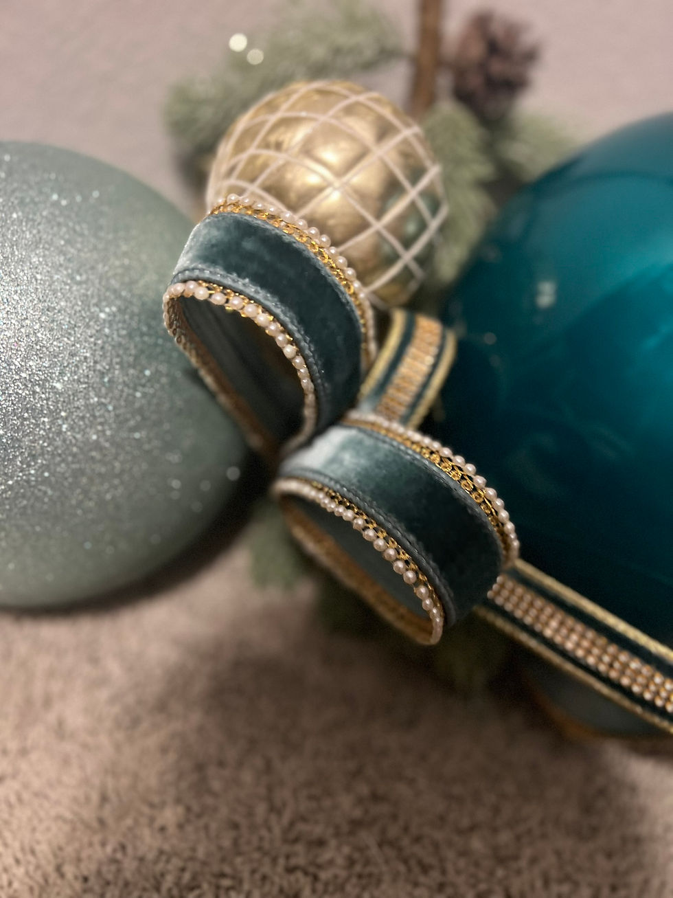
Teal + plum + pewter
A Christmas tree palette:
✔ sets the tone
✔ travels through the whole home
✔ dictates ribbon, ornaments, florals, garlands, and tabletop selections
✔ creates cohesion room to room
It isn’t literal — it guides decisions.
What Is a Christmas Tree Theme?
A theme tells the story on top of the palette.
Themes are narrative:
Woodland
Traditional
Glam
Old World European
Icy winter
Sugarplum nutcracker
Santa’s workshop
Minimalist luxe
A theme determines:
Character
Mood
Energy
Finishing touches
Where playful or sentimental accents appear
Think of the palette as the suit — the theme is the tie, shoes, and jewelry.
Why Most Homes Look “Almost Right”
Many homeowners choose a fun theme but skip the color discipline. Without a clear Christmas tree color palette, even beautiful décor can feel disconnected.
Result:
Too many colors competing
Décor that feels busy or scattered
Sentimental pieces lost in the mix
Mantel and tree telling two different stories
Garlands that don't relate to the entry or dining room
Christmas tree themes without palettes = visual noise. Palettes without themes = elegant but sometimes impersonal.
Combine them — and magic happens.
How Designers Layer the Two
A boutique designer always begins with the palette, then chooses a theme that complements it.
Example:
Palette: Navy, emerald, champagne
Theme: Modern glam woodland
Same tree, different theme:
Palette: Navy, emerald, champagne
Theme: Nutcracker luxe
The palette stays grounded — the theme defines the personality.
This is how you build a look that feels custom rather than cookie-cutter.
Where People Get Tripped Up (and How to Avoid It)
Mistake #1: Pinterest Everything
A saved board full of inspiration rarely matches your home. Designers translate ideas into a language your home speaks.
Mistake #2: Theme Shopping First
You fall in love with a character or motif… then nothing matches.
Mistake #3: Going Trend-Heavy
Trends cycle fast. Palettes evolve slowly and gracefully.
Mistake #4: Starting From Zero Every Year
With the right palette, you can refresh — not replace — décor year after year.
Where Your Palette Lives
You’ll see your core palette repeated in:
Tree ribbon & ornaments
Garlands and wreaths
Mantel design
Tabletops
Accents, stems, and picks
Stockings and soft goods
Your theme appears through:
Statement ornaments
Figurines or nutcrackers
Sentimental touches
Iconic pieces
Scales of whimsy vs elegance
The palette is the canvas. The theme paints the story.
How Sentimental Pieces Fit
Themes and palettes are not rigid.
They create room for:
Grandma’s ornaments
Kids’ handcrafted treasures
Travel memories
Annual collections
When everything else is unified, the memories shine instead of being lost in visual clutter.
Palette First. Theme Second. Always.
Choosing a palette in spring or summer:
✔ gives you sourcing flexibility
✔ spreads the investment across months
✔ allows for intentional planning
✔ avoids panic cart-filling at big box stores
✔ ensures your theme lands beautifully when the season arrives
And when November comes, you’re not hunting for “something that might work.” You already know what does.
Ready to Define Your Holiday Style?
Juniper & Gold creates palette-driven, story-rich holiday designs for homes and boutique businesses across Prosper, Celina, McKinney, and surrounding communities. If you’re dreaming of a theme — but aren’t sure how to make it feel elevated, cohesive, and uniquely yours — let’s talk.
The Art of Holiday Decor
When it comes to holiday décor, the art lies in the details. Every ornament, ribbon, and garland plays a role in telling your unique story. It’s not just about filling a space; it’s about creating an experience that resonates with warmth and joy.
Embracing Personal Touches
Incorporating personal touches can elevate your holiday décor. Think about the memories attached to certain ornaments or decorations. Perhaps a handmade ornament from your child or a vintage piece passed down through generations. These elements add depth and character to your design, making it truly one-of-a-kind.
The Importance of Cohesion
Cohesion is key in holiday decorating. A well-thought-out color palette ensures that every piece works harmoniously together. This doesn’t mean you can’t mix styles or themes; rather, it encourages a thoughtful approach to how you blend them. For instance, a traditional red and gold theme can beautifully coexist with modern metallics when anchored by a consistent color palette.
Seasonal Transitions
As the seasons change, so can your décor. A versatile color palette allows for easy transitions. You can refresh your holiday look without starting from scratch. By simply swapping out a few key pieces, you can breathe new life into your space while maintaining the essence of your original design.
Creating a Welcoming Atmosphere
The ultimate goal of holiday décor is to create a welcoming atmosphere. It’s about inviting friends and family into a space that feels warm and festive. Lighting plays a crucial role here. Soft, twinkling lights can transform a room, adding a magical touch that enhances the overall experience.
Warmly,
Stephanie
Owner & Designer
Juniper and Gold


Comments